The polished home design video got 40 likes. The plain one got 25,600.
One creator walks through a small bathroom he actually finished and explains one money-saving decision. The other is a polished montage of expensive-looking alternatives. Jeena came back close to a tie, with only a faint lean toward the first. In the wild it won by 640 times the likes.

Why I tested this
Two videos, same audience: people renovating a bathroom. Both are actually about the same idea, do not tile the whole thing. One is a creator walking through a small WC he clearly finished himself, explaining how he used large wall panels instead of porcelain stoneware to save on tiling. The other is a polished montage of cheaper-looking alternatives to expensive finishes: wood-look kitchen fronts, decorative plaster, a metal-effect wall, nature wallpapers, all cut together with a presenter.
On the surface, the polished one is the stronger-looking video. It is visually cohesive, it has genuinely pretty shots, and the report called its tone authoritative and useful. It is the one that looks like it should win on likes.
The wild numbers went the other way, and not by a little. The plain how-to got 640 times the likes. So I ran both through Jeena to see whether the attention data would explain a gap that size. It leaned toward the winner, but only slightly. The distance between "slightly" and "640 times" is what this piece is about.
The two videos, honestly
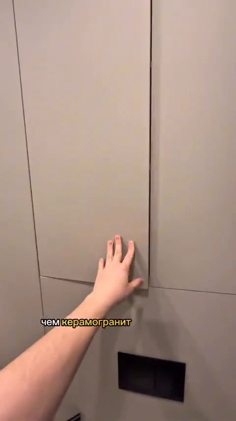
I want to be precise about what each one is, because the honest read depends on it. The practical video opens on the finished WC: beige large-format wall panels, a wall-hung toilet, a floating vanity, a lit arched niche. Then it cuts to a workshop where he drills the cistern housing and access holes into a porcelain slab, shows his Instagram profile grid, comes back to demonstrate the wall panels with his hand, points at the concealed cistern access hatch, gives one installation tip, and closes on a thumbs up with "save the video and subscribe." It is one concrete decision, shown in a room that plainly exists.
The aesthetic guide opens on a woman looking out a window in a styled bedroom, then rapid-fires many looks: Egger wood-look kitchen fronts, an aesthetic bathroom, a walnut sample board, a living room, a plaster-texture close-up, a metal-effect room, a wall of nature wallpapers, a framed plaster artwork with a red X over it. It closes on the presenter with a card reading "alternative to expensive finishes" and the word "save." It is a catalogue of possibilities, and much of it reads more like renders than a room someone lives in.
The difference that matters: one video demonstrates a single decision in a real room, the other shows many looks you cannot touch. Hold onto that, because by the end it is most of what is left.
What Jeena measured
Jeena put each video in front of its own panel of real viewers watching on their phones with the front camera on, tracking where their eyes went, what made them react, and how they rated the clip afterward. If a 640x gap were a craft problem, this is exactly where it would surface.
It mostly did not. The two came back close to a tie, with only a faint lean to the practical video.
In the lab: a near tie
| The practical reveal | The aesthetic guide | |
|---|---|---|
| Survey sentiment | Skewed "interesting" | Split "interesting" and "boring" |
| Strongest reaction | Wow peak 0.5, near the end | Wow peak 0.42, at 26s |
| Opening shot | The finished room | A lifestyle mood shot |
| Weakest stretch | The workshop middle | The static collages |
What Jeena saw in each
The practical reveal
Result first, then one concrete decision
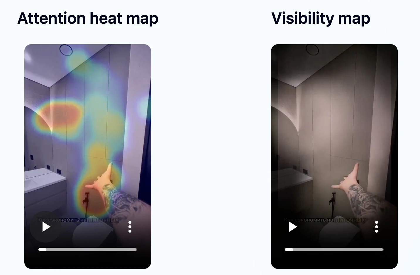
- •The finished WC opens the video and is where gaze goes first, an immediate, concrete answer to "what did this renovation actually turn into."
- •Reactions clustered around the second half, where his hand demonstrates the wall panels and the concealed cistern access hatch. A wow bump landed on that hands-on moment.
- •Survey words skewed toward "interesting."
- •The soft stretch was the workshop and drilling middle, where attention loosened and the blink rate rose.
- •Wow peak 0.5, landing near the end of the clip.
The aesthetic guide
Lifestyle open, then a catalogue of looks
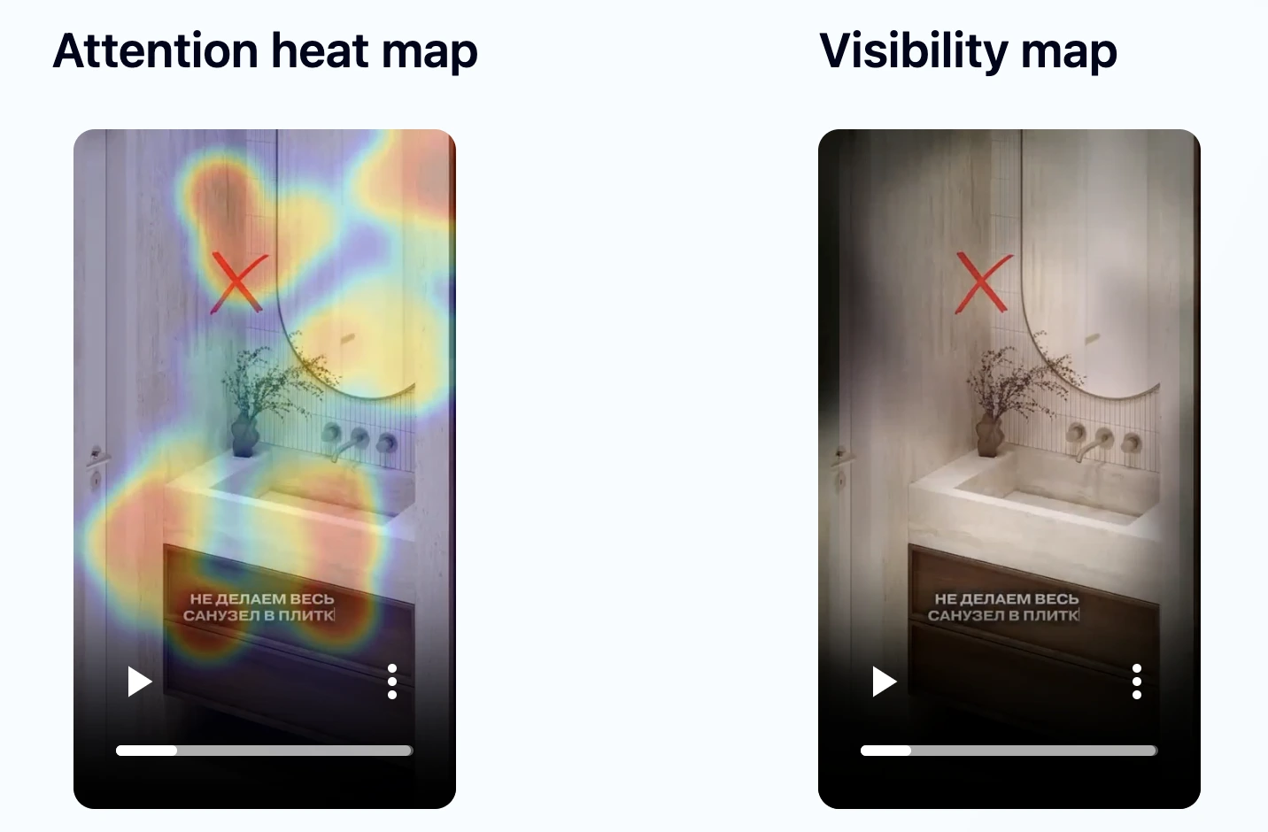
- •It opens on a styled lifestyle shot rather than a result, a softer start that did not answer a question up front.
- •Its strongest reaction was a wow peak of 0.42 on the metal-effect reveal around 26 seconds, close to the practical video's 0.5.
- •But survey sentiment split between "interesting" and "boring," and attention was intermittent through the collage middle.
- •Polished and credible throughout. The message landed, just unevenly.
- •Wow peak 0.42, on the metal-effect reveal around 26 seconds.
The reactions were close
Read those two columns again. Their strongest reactions were nearly level, a wow peak of 0.5 against 0.42. The only real separation is the survey: one video came back cleanly "interesting," the other split "interesting" and "boring." The aspirational clip did log more raw wow moments, but raw counts scale with how long a video runs and how big its panel is, so I do not read that as more engaging. This is not a video that failed the attention test. It is a video that tested a shade worse on sentiment than the one that went on to get 640 times the likes.
In the wild: hundreds of times apart
| The practical reveal | The aesthetic guide | Δ | |
|---|---|---|---|
| Views | 1,300,000 | 4,147 | ×314 |
| Likes | 25,600 | 40 | ×640 |
| Comments | 271 | 3 | ×90 |
| Shares | 30,000 | 25 | ×1,200 |
| Reposts | 300 | 1 | ×300 |
A near-tie in the lab, 640x in the wild
Almost nothing separated these two in the lab. Their strongest reactions were a hair apart, and the only edge was the practical video's cleaner survey sentiment. That edge is real. But it does not explain 640 times the likes or 314 times the views. The honest conclusion is that the attention test leaned toward the eventual winner, faintly, and came nowhere near predicting the size of the gap.
Here is the part that is worth paying for. What the test settled is that the craft was not the problem: both videos held attention and landed. When a video does leak attention, this is exactly where Jeena shows you the seconds to fix, before you post. Whatever moved 1.3 million people beyond that lives somewhere a front-camera panel does not reach, and it does not have to.
A near-tie in the lab. Six hundred and forty times the likes in the wild. The test pointed the right way and could not explain the size of it.
So what most likely separated them?
Since the attention data is close, the difference has to live where the two videos genuinely diverge: what they ask the viewer to do with the idea.
The practical video hands you one decision, demonstrated in a room that clearly exists. He drilled the holes, he finished the WC, he points at the exact panel and the hidden access hatch, and he asks you to save the video. It is a specific, save-and-share-worthy how-to from someone who obviously did the thing. The 30,000 shares are people forwarding a method worth passing on.
The aesthetic guide hands you a mood board. Many looks, beautifully shot, but nothing you can act on in the next hour, and much of it reading like renders rather than a lived-in room. It asks you to save an idea rather than a method. It earned interest and 25 shares.
One caveat I will not hide: that last part is me reading two videos, not a finding the eye-tracking produced. Jeena did not measure "is this a real project" or "how actionable is the tip." No attention test does. It is the most likely explanation for a gap the test could not see, and the save and share counts fit it, but it is a hypothesis, not a heatmap.
What this actually taught me
A faint attention edge is not a distribution forecast
A faint edge in survey sentiment pointed the right way here, and that is genuinely useful for catching a weak video before you post it. It is not a promise of reach. Same direction, 640 times apart. If you treat a decent attention read as a prediction of how far a video will travel, this pair is the warning.
A real project earns the save and the share a mood board does not
The practical video showed one decision in a room that exists and asked for the save directly. The aspirational one showed many looks you cannot touch. If saves and shares are what you are after, give people a method they can act on, not only an aesthetic to admire. I will flag that this is a marketer's read of the two clips, not something the eye-tracking measured.
Guard the middle in either format
Both videos leaked attention in the middle: the practical one during the workshop and drilling stretch, the aspirational one during its static collages. Neither format is immune to the mid-video drop-off. A couple of pattern interrupts in that stretch is the cheap fix, and the one thing the test flagged that you can act on directly.
The honest limits of this
The test does one job well: a panel of real viewers reads what held attention and what got a reaction, and that is enough to compare two videos on craft. It does not forecast reach. I do not know the two accounts, their follower counts, or how the algorithm chose to push each clip, and some of any 640x gap is the account and plain luck. I would be lying if I claimed to have isolated the creative from everything else.
What the test does settle is the craft. It told me both videos held attention and landed their message, and it showed me the exact seconds that leaked in each: the workshop middle here, the static collages there. That is the part you can fix before you post. The size of the wild gap is decided somewhere a front-camera panel does not reach.
Find out what your video actually does to viewers
If you make home design or renovation videos, you can run this exact analysis on your own. Upload it to Jeena. Real viewers watch it on their phones with the front camera on and share their impressions in a short survey. Jeena maps where their eyes went, when they raised their eyebrows, and which moments lost them. You get an attention heatmap, a visibility map, a wow-moments timeline, a summary of how viewers perceived the video, and three concrete recommendations. It shows you the exact seconds where attention slips, so you can fix the edit before you post, while a fix still costs nothing. The craft is the part Jeena settles; the idea is yours to get right.
A typical test costs around ten euros and arrives within a day.
Frequently asked
Why did the plain practical video beat the polished one by 640 times the likes?+
Honestly, the attention test only partly explains it. In the lab the two came back close to a tie: their strongest reactions were nearly level (a wow peak of 0.5 against 0.42), and the only real separation was survey sentiment, a cleaner "interesting" for the practical video against a split "interesting" and "boring" for the polished piece. The polished clip logged more raw wow moments, but raw counts scale with video length and panel size, so that is not a fair comparison. A faint sentiment edge does not account for 640 times the likes. The most likely driver, and this is a read of the two clips rather than a heatmap finding, is that the practical video demonstrated one concrete money-saving decision in a room that clearly exists and asked viewers to save it, while the aspirational one showed many beautiful looks you cannot act on. One gave people a method to save, the other an aesthetic to admire.
Does this mean aspirational or mood-board style videos always underperform?+
No. The aspirational video did not fail the attention test. Its strongest reaction was nearly as strong as the practical clip's, and it had genuinely pretty moments. Its survey sentiment was mixed and its middle collages let attention drift, but the format is not the problem. A video that opens on a concrete result, keeps motion in its collage sections, and anchors each look to a specific, actionable decision would likely behave differently. The lesson here is narrower: a faint attention edge in a test is not a prediction of how far a video will travel.
Can eye tracking predict whether a video will go viral?+
No, and this comparison shows why. Eye tracking measures whether a video holds attention and whether its message lands. Both of these videos cleared that bar, the practical one by a little more, and yet they ran hundreds of times apart in the wild. Reach also depends on the strength and forwardability of the idea, the account, timing, and luck, none of which a front-camera panel measures. What the test is genuinely good for is catching a video that fails on attention before you post it.
What is Jeena?+
Jeena is a neuromarketing platform for short-form video. Real people watch your video on their phone with the front camera on. Jeena captures their gaze direction, blink rate, eyebrow raises, and their impressions of the video in a short survey afterward. You receive a report with a frame-by-frame attention heatmap, a visibility map, a wow-moments timeline, a summary of how viewers perceived the video, and three concrete recommendations for making it work harder.
How does Jeena measure viewer attention?+
With smartphone front-camera gaze tracking. Each viewer calibrates once, then watches your video while the camera records where their gaze lands frame by frame and flags eyebrow-raise reactions, combined with a short impressions survey afterward. The result is a per-second timeline of what real viewers actually looked at and reacted to, plus how they perceived the video overall.
How much does it cost to test a video on Jeena?+
A typical test costs around ten euros. See the pricing page for current rates.