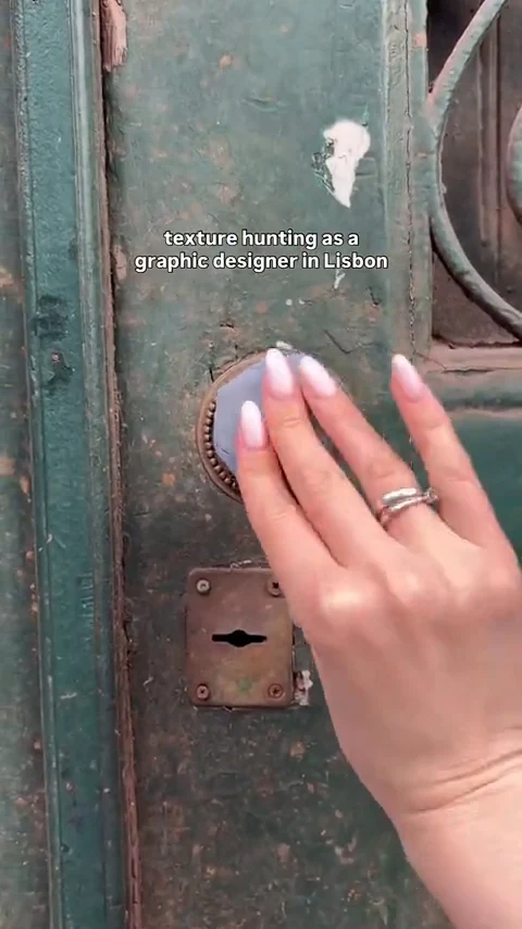
She pressed clay onto an old door. It got 51.6M views. His polished portfolio got 10,700.
One creator presses clay onto a weathered door and peels off the texture, out on the street. The other is a guy at a laptop showing his finished work. The polished video looked like the safer bet. It lost by thousands of times, on every metric.
Why I tested this
When I think about what a graphic designer should post to go viral, my first instinct is the work itself. Show the poster. Show the typographic system. Show the thing you made in all its finished, polished glory. If your craft is what makes you worth following, surely the argument is: here is my best work.
So I found two takes on it. One is a designer pressing clay onto a weathered door and lifting off its texture, out on the street. The other opens on a guy at a laptop, cutting through his finished designs. Clean framing, clear designer identity, a survey score of 4.18, and the opening gaze going straight to him. On paper, the polished one is the obvious bet.
By every rule of thumb about posting your best work, the portfolio should have won by a comfortable margin. It lost by thousands of times. The size of that gap made me rethink what "showing your craft" actually means in short-form video.
The setup
Both videos open with the creator establishing the same identity: a graphic designer. Both are short-form, both filmed on a smartphone, both aimed at the same niche: people interested in creative process and visual craft. Neither is technically broken. Both received above-average survey scores from Jeena's panel.
The craft demo happens outside. She presses clay onto a weathered door, peels off the texture, and holds it up. Casual, handheld, a little rough. The portfolio video happens inside. He sits at a laptop and cuts through his finished designs, clean type and all. It looks like a proper designer reel. It reads as professional.
From the outside, the portfolio version is the one that looks viral-ready. The eye-tracking told a completely different story.
What Jeena saw
The craft demo
Hands-on process, street opener, maximum wow peak
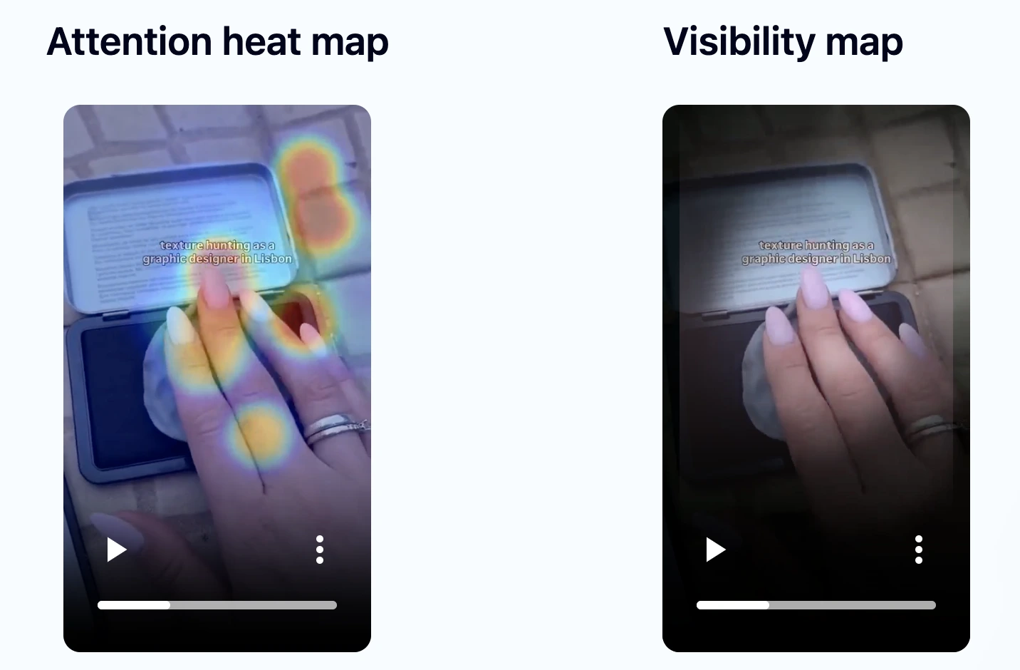
- •The opener (0 to 2 seconds) sets it up fast. Gaze goes straight to the weathered door, and a wow reaction of 0.4 fires at the very start. The hook lands.
- •The close-up press (2 to 6 seconds) grabs the most attention: eyes lock on the door as she presses the clay in, with smaller synced reactions around 0.2 through the sequence.
- •The middle section (6 to 10 seconds) showed the largest drift. Attention wandered during the printed reference card in the tin lid, which dominated the frame and pulled focus off the action.
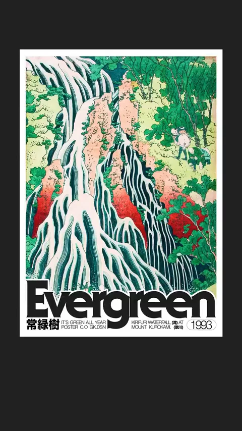
- •She inks the clay and stamps the pattern into her sketchbook. The strongest reaction of the whole test lands on that final stamped print near the end, when she lifts the clay to reveal the sunflower motif on the page. Survey average: 4.6.
- •Peak wow intensity: 1.0 (the maximum) at 26.5 seconds, on that stamped reveal. Survey tags: "funny," "interesting," "catchy," "surprising."
The portfolio
Polished mockups, laptop opener, brief wow peak
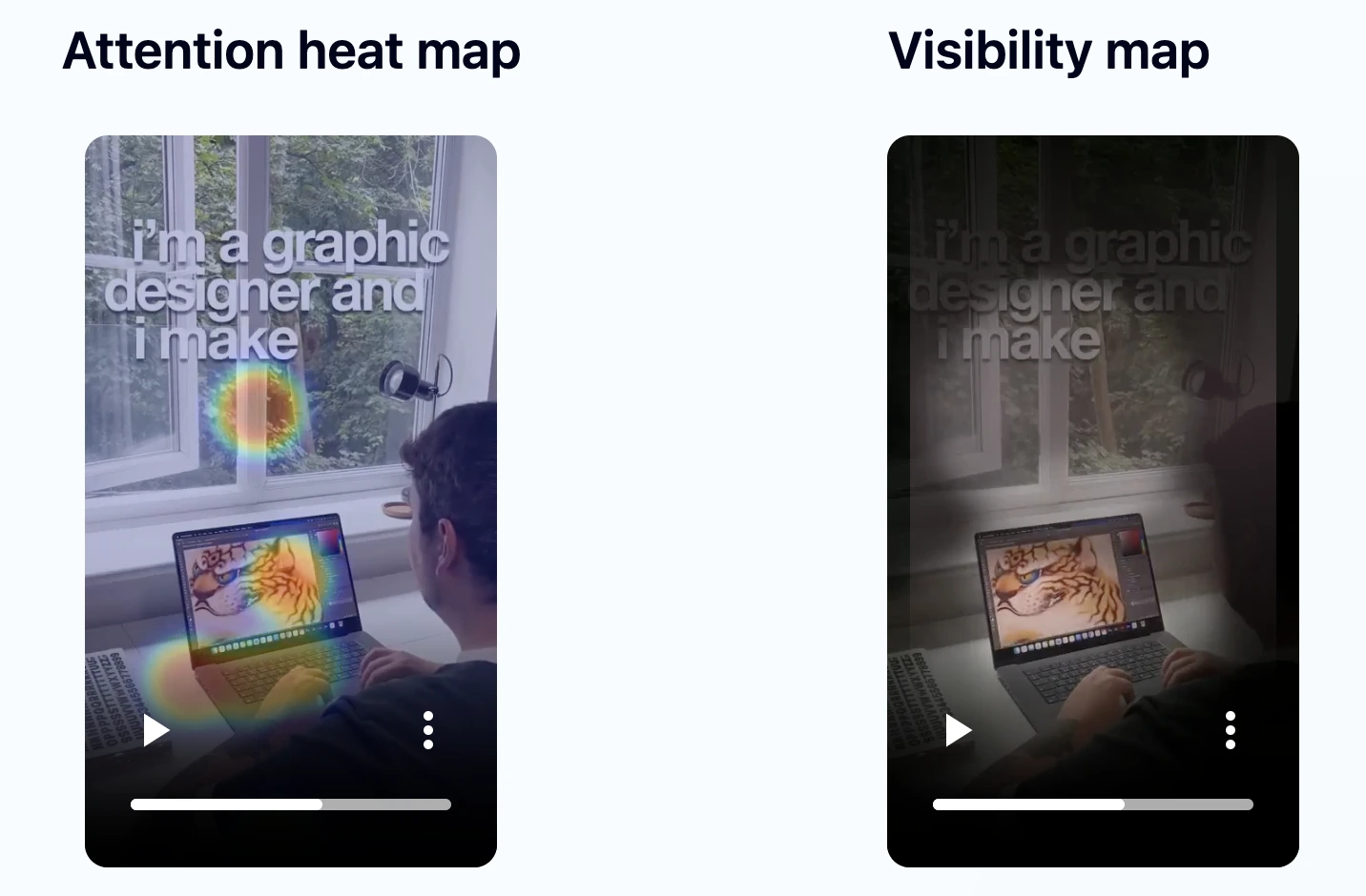
- •The process opener (0 to 2 seconds) drew gaze onto the creator working at the laptop, a strong authentic-process opening that matched the "interesting" survey tags.
- •The identity caption (2 to 6 seconds) made the designer role explicit and the creator remained visually central. Seven "interesting" and four "catchy" tags from the panel.
- •The portfolio showcase (6 to 12 seconds) produced the strongest design impression and coincided with a few small synchronized wow peaks around 0.2. Survey score: 4.18.
- •The finished designs did not hold attention the way the tactile press did: gaze drifted through the portfolio section even while the strongest work was on screen.
- •Peak wow intensity: 0.3, right at the start. Blink rate elevated throughout, indicating intermittent distraction rather than sustained focus.
Both videos communicated craft credibly
The portfolio received an above-average survey score (4.18) and its opener pulled gaze straight onto the creator. The craft demo also scored well (4.6) and pulled tags like "interesting" and "catchy" from the panel.
On paper these videos are close. Neither is badly made. The gap comes from one thing: you can almost feel the clay press. You can only look at the finished designs.
What happened in the wild
| The craft demo | The portfolio | Δ | |
|---|---|---|---|
| Views | 51,600,000 | 10,700 | ×4,822 |
| Likes | 807,000 | 377 | ×2,141 |
| Comments | 2,095 | 17 | ×123 |
| Shares | 37,700 | 13 | ×2,900 |
| Reposts | 6,549 | 4 | ×1,637 |
The process you can almost feel beats the work you can only look at. By thousands of times.
The craft demo pulled 51.6 million views and 807,000 likes. The portfolio pulled 10,700 views and 377 likes. That is not a small difference in execution; it is a fundamental difference in what kind of content creates a physical response in the viewer.
Jeena measured it directly. The tactile texture press produced a wow peak of 1.0 at 26.5 seconds, the maximum possible intensity. The polished portfolio's strongest reaction stopped at 0.3, right at the start.
The portfolio had better finished work. The designs were crisp. The type was clean. But it did not hold the eye: attention drifted even while the finished work was playing. You watch finished work. You do not do anything with it. When she presses clay into a door and peels off the texture, you can almost feel it in your own hands. People admired the portfolio. They shared the press.
A perfect 1.0 against a 0.3. You share what you can feel, not what you can only look at.
Three creative choices that drove the split
What the opener anchors on
A close-up of a weathered, textured door. The physical stuff is the premise, not the backdrop. Gaze goes straight to the door.
The creator at a laptop in an interior setting. Authentic and credible, pulling the opening gaze straight onto the creator. Clean, professional, and expected.
The door gives the craft demo a question from the first frame: what is she doing with it? The laptop opener shows competence but asks nothing.
Whether the core moment is tactile or visual
She presses clay onto the door. You can imagine the feel of it: pressure, texture, weight. Eyes lock on the door during the press.
Finished designs shown full-frame. Nice to look at, nothing to feel. Attention drifts while they play.
Hands-on actions hold attention differently than finished displays. The press is not prettier than the designs. It just pulls you in.
Where the wow peak lands and how intense it is
Wow peak of 1.0 (maximum) at 26.5 seconds. The reveal pulled gaze onto her hand and the freshly stamped print.
Wow peak of 0.3, right at the start. The strongest design moment coincided with a small synchronized peak early on, then dissipated.
A wow peak at the end of a tactile reveal carries more weight than a brief spike at the very start. Building toward a payoff gives the viewer something to stay for.
Three transferable principles
Pick a process people can almost feel, not just look at
Pressing, folding, mixing, cutting, carving. Viewers can almost feel these. When your core moment is something physical, people follow it with more than their eyes, and that racks up wow moments. Finished work only gives them something to look at. A texture you press gives them something to feel.
Build toward a reveal rather than opening with your best work
The portfolio led with finished work. That shows skill but leaves nowhere to go. The craft demo built from a raw door to a finished texture tile, so people stayed to 26 seconds. Its 1.0 wow peak landed late because she was revealing something, not just showing it.
Guard the middle section as hard as the hook
Jeena flagged the craft demo's biggest drift at 6 to 10 seconds, during a static insert that took over the frame. The fix: shrink it, reframe toward her hands, add a couple of pattern interrupts. The hook landed and the reveal landed, but the middle leaked. In both videos, the middle is where attention wanders.
What this means if you make these videos
If you are a designer, illustrator, or maker who creates videos about your work, the instinct to lead with your best output is understandable and almost certainly wrong for short-form. The portfolio showcases what you can produce. The process demo shows something the viewer can feel alongside you. Those are different categories of content, and the wow-moment data shows they land very differently.
The craft demo had real weaknesses. Attention drifted in the middle. Blink rate went up. But the hands-on moments cut through: eyes locked on the door, and a 1.0 wow peak. The polished portfolio never got near those, better-looking work and all.
The practical question is not "should I make process content instead of portfolio content?" It is: within whatever format you already use, where is the moment the viewer could almost feel what you are doing? That moment is worth building toward, worth isolating, worth letting breathe. The polished result can live on your website. The thing happening in your hands is what short-form video was made for.
Find out whether your portfolio or your process lands harder
If you make videos about creative work, the difference between showing the thing and showing the making of the thing can be enormous. You can run this exact analysis on your own video. Upload it to Jeena. Real viewers watch it on their phones, with the front camera on, and share their impressions in a short survey. Jeena maps where their eyes went, when they raised their eyebrows, and which moments lost them. You get an attention heatmap, a visibility map, a wow-moments chart, a summary of how viewers perceived the video, and three concrete recommendations.
No "schedule a call." No sales rep. Upload, get your report.
Frequently asked
Why did the casual street demo outperform the polished portfolio by thousands of times over?+
The craft demo had a hands-on core moment: she presses clay onto a weathered door and peels off the texture. People follow that with more than their eyes, which purely visual content rarely gets. Jeena measured a 1.0 wow peak (the maximum) at the reveal, versus 0.3 for the portfolio's best moment. The finished designs looked better, but they did not hold the eye the way the press did. Watching something get made pulls people in.
The portfolio had a better survey score opener. Why did that not translate to distribution?+
The portfolio's opener pulled gaze straight onto the creator and its survey score (4.18) was above average. But a strong opener can co-exist with a weak peak. Its wow-peak was 0.3, arriving right at the start and quickly dissipating. The craft demo's 1.0 peak arrived at 26.5 seconds, built toward by a tactile process sequence. In short-form video, a late payoff that builds to maximum intensity appears to drive sharing and comments more effectively than a strong opening that has nowhere to go.
What is Jeena?+
Jeena is a neuromarketing platform for short-form video. Real people watch your video on their phone with the front camera on. Jeena captures their gaze direction, blink rate, eyebrow raises, and their impressions of the video in a short survey afterward. You receive an AI-powered report with an attention heatmap, a visibility map, a wow-moments chart, a summary of how viewers perceived the video, and three specific recommendations for making the video work harder.
How does Jeena measure viewer attention?+
Jeena uses smartphone front-camera gaze tracking. Each engager calibrates once, then watches your video. The platform records where their gaze lands frame by frame, flags moments of surprise from facial expression, and combines that with a short impressions survey afterward. The result is a per-second timeline of what real viewers actually looked at and felt, plus a summary of how they perceived the video overall.
Can I test my own video on Jeena?+
Yes. Sign up, upload your video, and Jeena runs the test with its panel of real viewers. The report typically arrives within a day, with an attention heatmap, a visibility map, a wow-moments chart, a summary of how viewers perceived the video, and three concrete creative recommendations.
How much does it cost?+
A typical test costs around ten euros. See the pricing page for current rates.