Same trendy font, 117x the views. Eye tracking shows what the faceless guide missed.
Two tutorials taught the same edit-app font. One put it inside a story above a face. The other put it across a mountain lake. Jeena watched both with real viewers to see exactly where the gaze went.
Why I tested this
I have been teaching myself short-form video as a founder, so I watch a lot of tutorials. A couple of weeks ago I bumped into a really clean faceless guide on a trendy font effect. Centered phone mockup, tidy landscape backdrop, every step legible. The kind of tutorial that makes you want to save it.
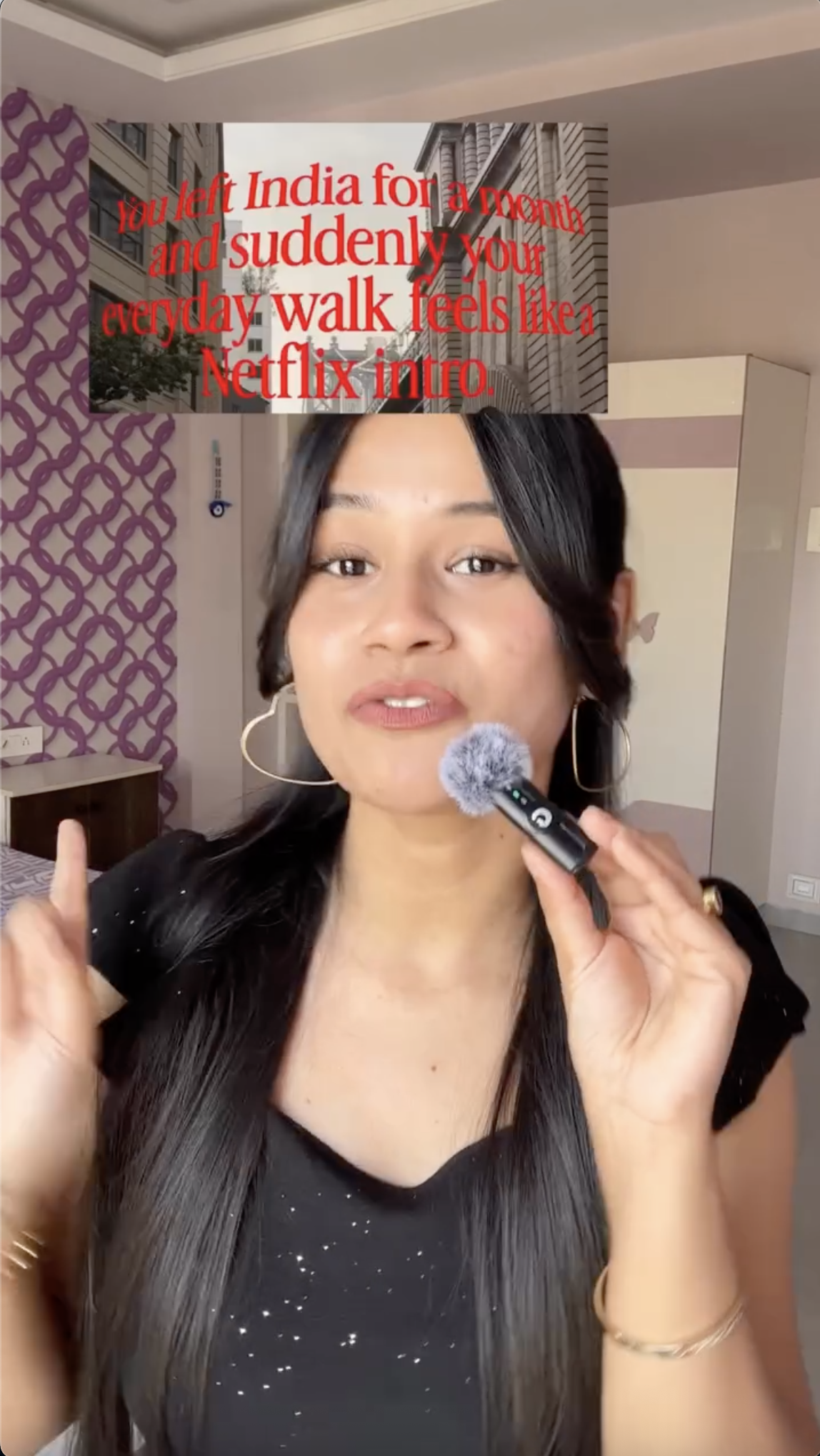
A few days later the same trick showed up in my feed in a totally different shape: a person on camera, the trendy font already used as a caption above her head (a small "Netflix-intro" frame about coming back to India), the same edit-app steps later. The faceless guide is obviously the better tutorial, I thought. Cleaner. No distraction.
Then I noticed the view counters. The face-led version had roughly a hundred times the views of the clean faceless one. Same trick. Same app. So I went looking for both videos, opened Jeena, and watched what real viewers actually did with their eyes. Because the only question a view count cannot answer is where on the screen those eyes landed in the first seconds.
The setup
Both videos chased the same viewer need: learn a trendy font fast, get the satisfying finished look. Both were legible. Both ended up at the same edit-app screens. The thing I could not see without Jeena was the first second.
beauty_luxe_by_samrudhi opens with the font already doing its job. The trendy red serif sits above her head as a "Netflix-intro" caption over a small street scene, and her face is fully visible underneath. The font is the subject of the video and the proof at the same time.
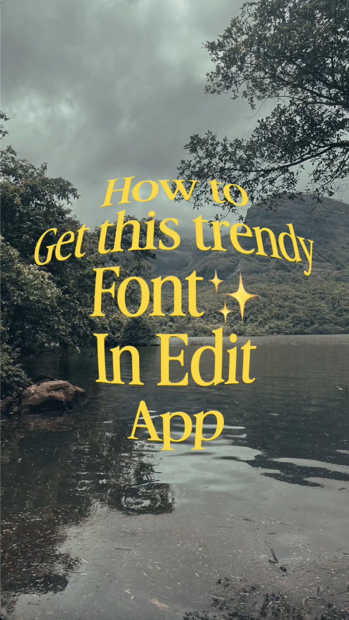
digitalcontouring opens with the font as a promise: huge yellow serif text filling the frame ("How to Get this trendy Font In Edit App") over a moody mountain lake. No face. Beautiful scenery. The question is whether the eye lands on the text or wanders into the landscape behind it.
What Jeena saw
Person-led
Font as the content of a story, face anchor below
- •Trendy font already doing its job in the opener, set as a "Netflix-intro" caption above a face.
- •Person fully visible below the caption, gives the viewer something to anchor on.
- •Early payoff arrives in the first seconds with multiple wow moments.
- •Step-by-step relies on clear, readable app UI screen recordings.
- •On-screen labels make each action explicit (e.g. "Go to edits", "write your text").
Faceless guide
Font as a promise over a scenic backdrop
- •Huge serif "How to Get this trendy Font" fills the frame over a moody lake-and-mountains landscape.
- •No person on screen. Nothing to anchor the eye except the text and the scenery.
- •Hands-on section focuses on scrolling and selecting fonts and effects.
- •Multiple short effect-reveal moments during the selection phase.
- •Instructional clarity is prioritised over pacing variety.
You can see the divergence in the opener
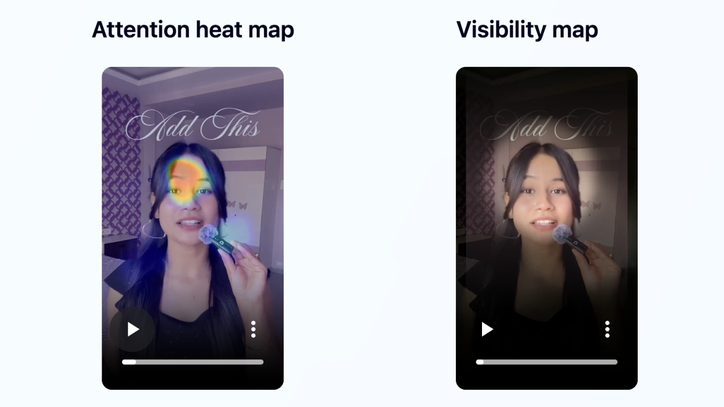
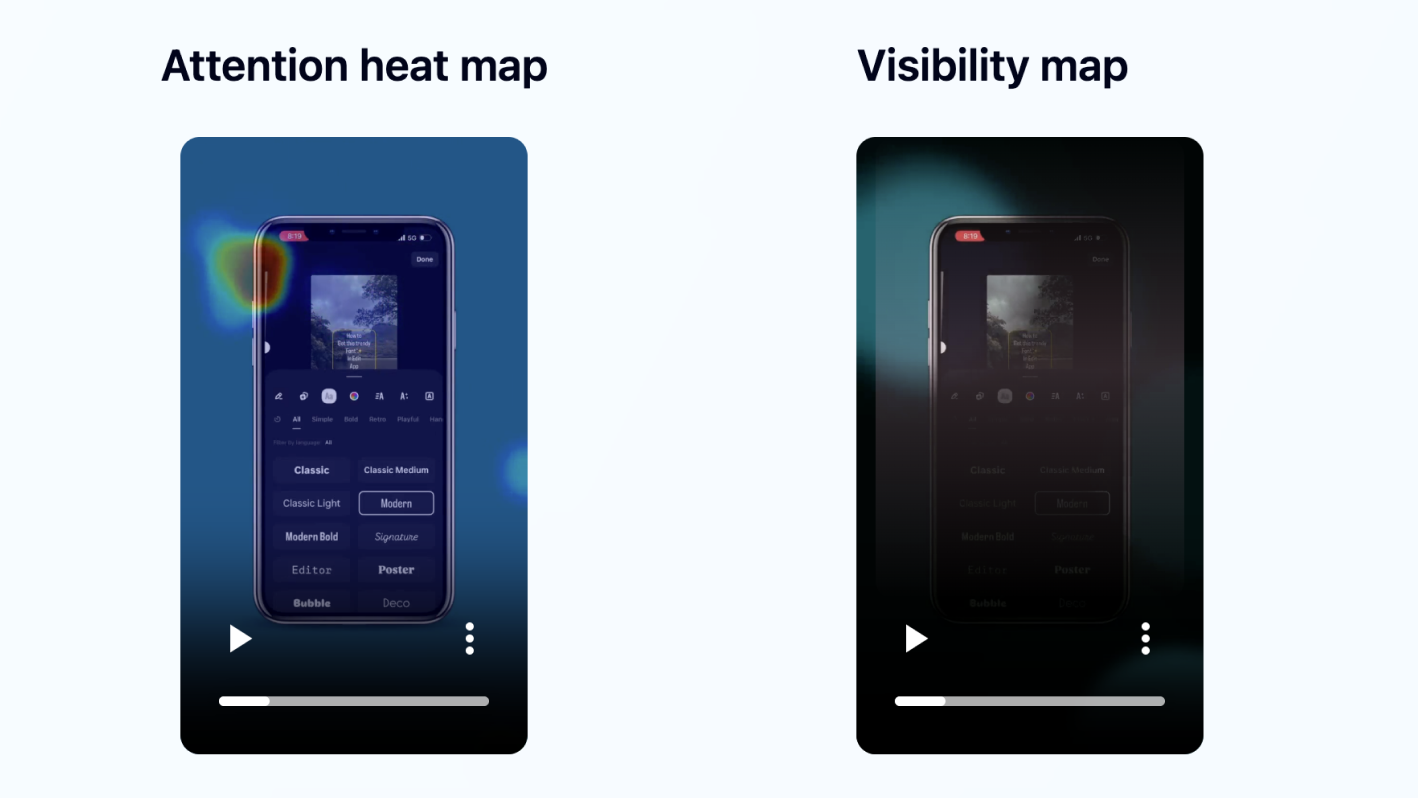
Look at the two hero portraits at the top of this article. Same skill. Same edit app. Same trendy font.
The person-led opener uses the trendy font as the content of a tiny story (the "Netflix-intro" caption) and puts a face under it. The viewer has something to look at and a reason to keep looking. The faceless opener uses the font as a banner over a mountain lake. Beautiful. And the eye wanders into the scenery instead of staying on the text.
Jeena measured the cost of that one decision. A view count never could.
The faceless guide was cleaner. It lost anyway.
Both videos taught the same skill. The faceless guide was arguably the better tutorial: cleaner, tidier UI, easier to follow. It got 117 times fewer views.
Jeena's gaze data showed the split started in the opener. The person-led opener gave viewers a face and the font in a single, scannable shape (caption above the head), and the heatmap shows attention locking onto the face. The faceless opener gave viewers a banner and a landscape, and the heatmap shows attention literally leaving the phone mockup for the upper-left of the frame. By the time the tutorial steps arrived, the person-led video had already converted the early wow into share-worthy attention. The faceless one had to recover from gaze that had already wandered into the sky.
You are not choosing between "better" tutorials. You are choosing what to put on screen during the first two seconds, and whether you have given the eye somewhere to land.
The faceless guide was arguably cleaner. The face-led version won 117 to 1 anyway.
Three creative choices that drove the split
What the opener asks the eye to do
Trendy font used as the content of a story (a "Netflix-intro" caption) with a face fully visible underneath. Eye lands on the caption, drops to the face, stays.
Trendy font used as a banner over a scenic lake-and-mountains landscape. Eye splits between the text and the scenery.
Jeena saw a cleaner first-second gaze trace on the person-led video. The faceless guide leaked attention into the background before the tutorial began.
Attention retention during the hands-on steps
Readable UI walkthrough with explicit labels. Sustained focus slid during the detailed step-by-step.
Neat and legible guide. Attention drifted quickly mid-tutorial.
Both formats lost some gaze in the hands-on portion. Jeena flagged the same fix on both: 2-to-3-second caption-synced micro pattern interrupts. Tutorial clarity alone does not sustain replays.
What converts a watch into a share
Outcome-driven wow moments supported by concrete examples, with a person to send the video to a friend about.
Useful-feeling clarity with effect reveals, but no human anchor to share with a friend ("you should try this").
The person-led video won decisively on the behaviours that amplify distribution: shares and reposts. The faceless one read as useful but not shareable.
What happened in the wild
| Person-led | Faceless guide | Δ | |
|---|---|---|---|
| Views | 3.3M | 28.1k | ×117 |
| Likes | 70.1k | 129 | ×543 |
| Comments | 228 | 11 | ×20.7 |
| Shares | 56.3k | 319 | ×177 |
| Reposts | 1.6k | 3 | ×538 |
Three transferable principles for short-form tutorials
Give the opener somewhere for the eye to land
A face is the easiest anchor. A piece of content using the skill is the second easiest. A banner over a scenic background is the hardest, because the eye is free to wander. The faceless guide put a beautiful landscape behind its trendy-font banner. Jeena watched viewers leak gaze into the mountains before the tutorial started.
Convert tutorial steps into micro pattern interrupts every 2 to 3 seconds
Tutorial steps run as a steady sequence by default, and steady sequences leak attention. Both videos showed gaze drop-off in the same window. Insert a whip-zoom, a freeze, a label pop, or a quick sound cue at 8s, 16s, and 24s. Recoveries are cheap; lost gaze is not.
Mirror the opener at the end so the cut to the start looks intentional
Both videos lost attention at the final hold. A short visual mirror of the opening shot in the last 1.5 to 2 seconds makes the loop back to the start feel like a feature, not a glitch. Loop-friendly endings get rewatched, and the algorithm reads a second view as a strong signal.
What this means if you make these videos
If you teach a skill in short-form video, the temptation is to make the cleanest possible tutorial. Cleaner UI. Tighter cuts. No distraction. That instinct is right for retention. It is incomplete for distribution.
The person-led opener does work that the cleaner format does not: it gives the viewer a face to anchor on, a piece of content that already uses the skill, and a reason to share with one friend who needs the same thing. The shareable part is not the tutorial. The shareable part is the proof in the first two seconds, and the human attached to it.
A faceless guide can still work. It needs to compensate with stronger pattern interrupts during the tutorial, a louder reveal, and a loop-friendly ending. And it needs to stop competing with its own background for the viewer's eye in the first second. Cleanliness alone is not the lever. Where the gaze goes is.
Test the same thing on your own tutorial
You can run this exact analysis on your own video. Upload it to Jeena. Real viewers watch it on their phones, with the front camera on, and share their impressions in a short survey. Jeena maps where their eyes went, when they raised their eyebrows, and which moments lost them. You get an attention heatmap, a visibility map, a wow-moments chart, a summary of how viewers perceived the video, and three concrete recommendations.
No "schedule a call." No sales rep. Upload, get your report.
Frequently asked
Why did the face-led tutorial outperform the faceless one by 117 times?+
Both videos taught the same trendy font with comparable production quality. Jeena's eye tracking shows the gap opened in the opener: the person-led opener used the trendy font as the content of a small story (a "Netflix-intro" caption) with a face fully visible underneath, giving the eye a clear place to land. The faceless guide put a huge serif banner over a moody mountain lake, and the eye split between the text and the scenery before the tutorial even started. Distribution behaviours (shares, reposts) followed the anchoring, not the tutorial quality.
Is a faceless format ever the right call for short-form tutorials?+
Yes, when the audience is already searching for the exact tutorial (saves, returning viewers) rather than discovering it on a For You feed. Faceless tutorials index well for search-driven traffic and for niche-expert positioning. For cold-discovery virality, where the first two seconds decide whether viewers stay, an opener with a clear visual anchor (a face, or the skill already being used as content) almost always wins.
Why is eye tracking the right tool for this question?+
A view count tells you the video underperformed. It cannot tell you where in the timeline the viewer gave up, or which element on screen pulled their gaze. Survey data tells you what viewers thought after they watched, but not which frame their eyes were on when they swiped. The "scenic background pulling gaze away from the font banner" effect in the faceless guide is invisible to both. The only way to measure it is to watch viewers watch, frame by frame, which is what Jeena does with phone front-camera gaze tracking.
What is Jeena?+
Jeena is a neuromarketing platform for short-form video. Real people watch your video on their phone with the front camera on. Jeena captures their gaze direction, blink rate, eyebrow raises, and their impressions of the video in a short survey afterward. You receive an AI-powered report with an attention heatmap, a visibility map, a wow-moments chart, a summary of how viewers perceived the video, and three specific recommendations for making the video work harder.
How does Jeena measure viewer attention?+
Jeena uses smartphone front-camera gaze tracking. Each engager calibrates once, then watches your video. The platform records where their gaze lands frame by frame, flags moments of surprise from facial expression, and combines that with a short impressions survey afterward. The result is a per-second timeline of what real viewers actually looked at and felt, plus a summary of how they perceived the video overall.
Can I test my own tutorial video on Jeena?+
Yes. Sign up, upload your video, set a goal (Views, Sales, Pitch, Followers, and so on), and Jeena runs the test with its panel of engagers. The report typically arrives within a day, with an attention heatmap, a visibility map, a wow-moments chart, and three concrete creative recommendations.
How much does it cost?+
A typical test costs around ten euros. See the pricing page for current rates.