Four things Instagram analytics cannot show you about your video
The retention curve tells you when viewers left. It cannot tell you where on the screen the eye was, what made them react, how they felt about the video, or whether any of it is fixable before you post.
Why I wrote this
A creator posts a video, looks at Instagram Insights the next morning, sees a watch completion of 28 percent and a retention curve dropping at the four-second mark, and concludes "the hook is broken." That conclusion is probably right. The harder question is what to do about it.
Instagram analytics is good at telling you what happened. A lot of articles trying to sell you on better tools treat it as if it were not. The honest gap is not in whether the dashboard reports the drop. The dashboard does. The gap is in everything around the drop. Which on-screen element was pulling the eye when it happened. Whether viewers reacted. How they felt about the video. And whether you can do anything about it before the next post goes live.
So this is the short version of what the dashboard does not show, and how to see those things instead.
What Instagram analytics already tells you
Watch completion percent. The retention curve, second by second. Likes, comments, shares, follows. Average watch time. The post that came from this video.
For deciding whether a video worked, that is enough. The numbers are real, and they reflect what actually happened with viewers in the wild after the post went live.
Four things the dashboard does not show
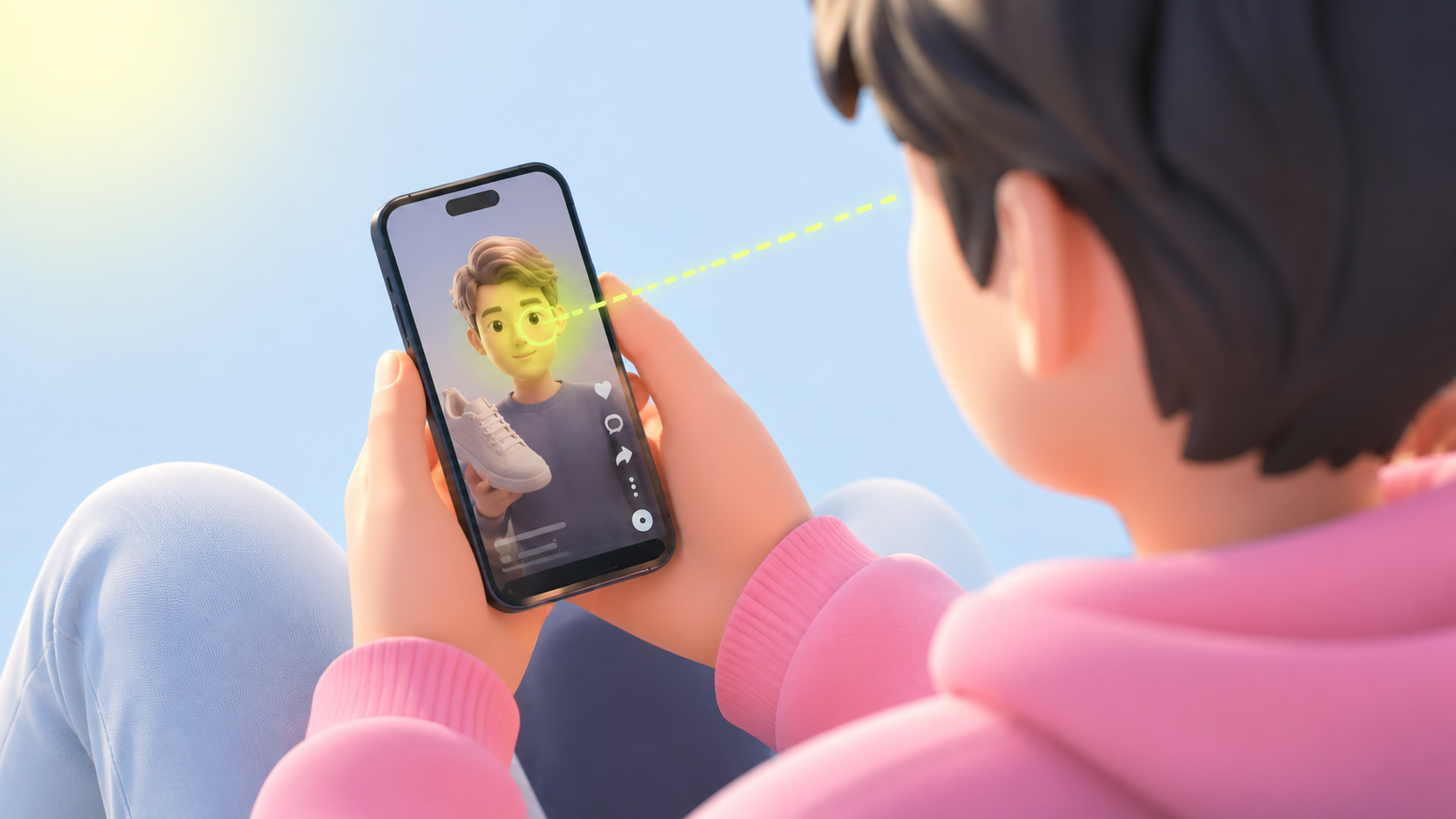
Where on the screen the eye was when viewers dropped
The retention curve tells you the second viewers left. It cannot tell you which on-screen element they were looking at right before. Was the eye on the speaker face, on the title text, on the background prop, on the brand logo? The fix is different for each. The retention curve treats the frame as a single pixel.
Whether viewers reacted at the moments you wanted them to
Instagram does not record the viewer face. An eyebrow raise, a flicker of surprise, none of those signals show up in the dashboard. The video either kept them watching or did not. Whether the kept-watching ones felt anything is invisible. A video can hold a viewer for the full runtime and leave them feeling nothing, and the dashboard reports that as a success.
How viewers would describe the video
The dashboard does not ask viewers anything. Whether your video came across as funny, boring, catchy, informative, or distracting is not in the analytics. For categories where the felt impression matters more than the watch completion (anything pitching a feeling, a brand, a relationship), the dashboard is reporting the proxy metric and skipping the actual one.
Whether any of this is fixable before you publish
Instagram measures after the post goes live. The retention curve only exists for videos that have been seen by the algorithm. If the hook is broken, you find out by underperforming in public. The dashboard cannot tell you anything about a draft sitting in your camera roll.
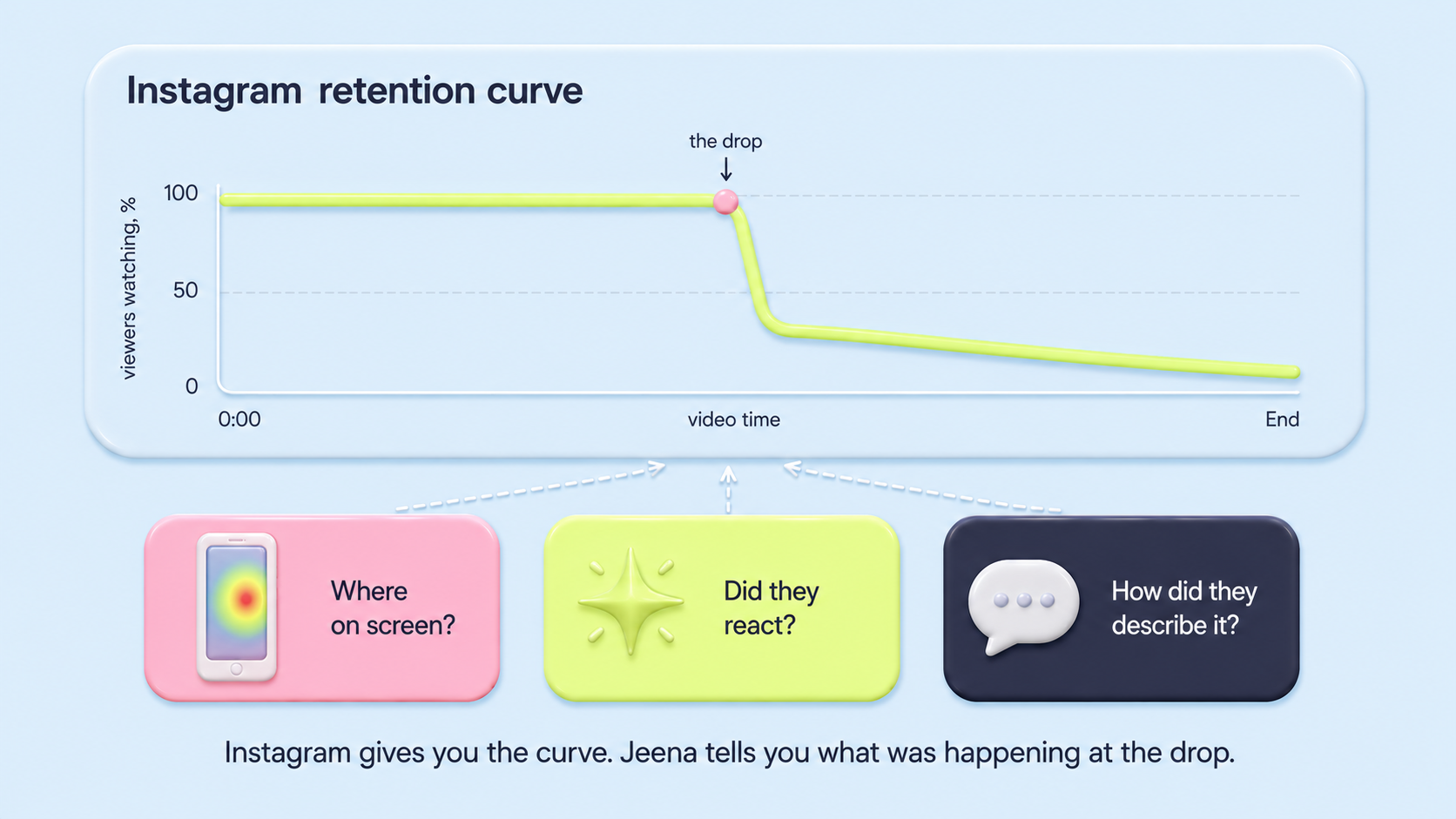
The retention curve tells you the second viewers left. It cannot tell you which on-screen element pulled them away.
What changes when you have those four things
The shift is the kind of question you can ask. Not "did the video work" (the dashboard answers that), but "which specific creative decision made the hook leak, and what should the next version do differently". The first question is a verdict. The second is a fix.
And once the test happens before the post, the cost of a broken hook is the five-viewer test, not the public flop.
How Jeena fills each gap
The four gaps above are not abstract. Each one maps to a specific measurement layer Jeena runs while viewers watch your video. Here is what each layer is doing underneath the report.
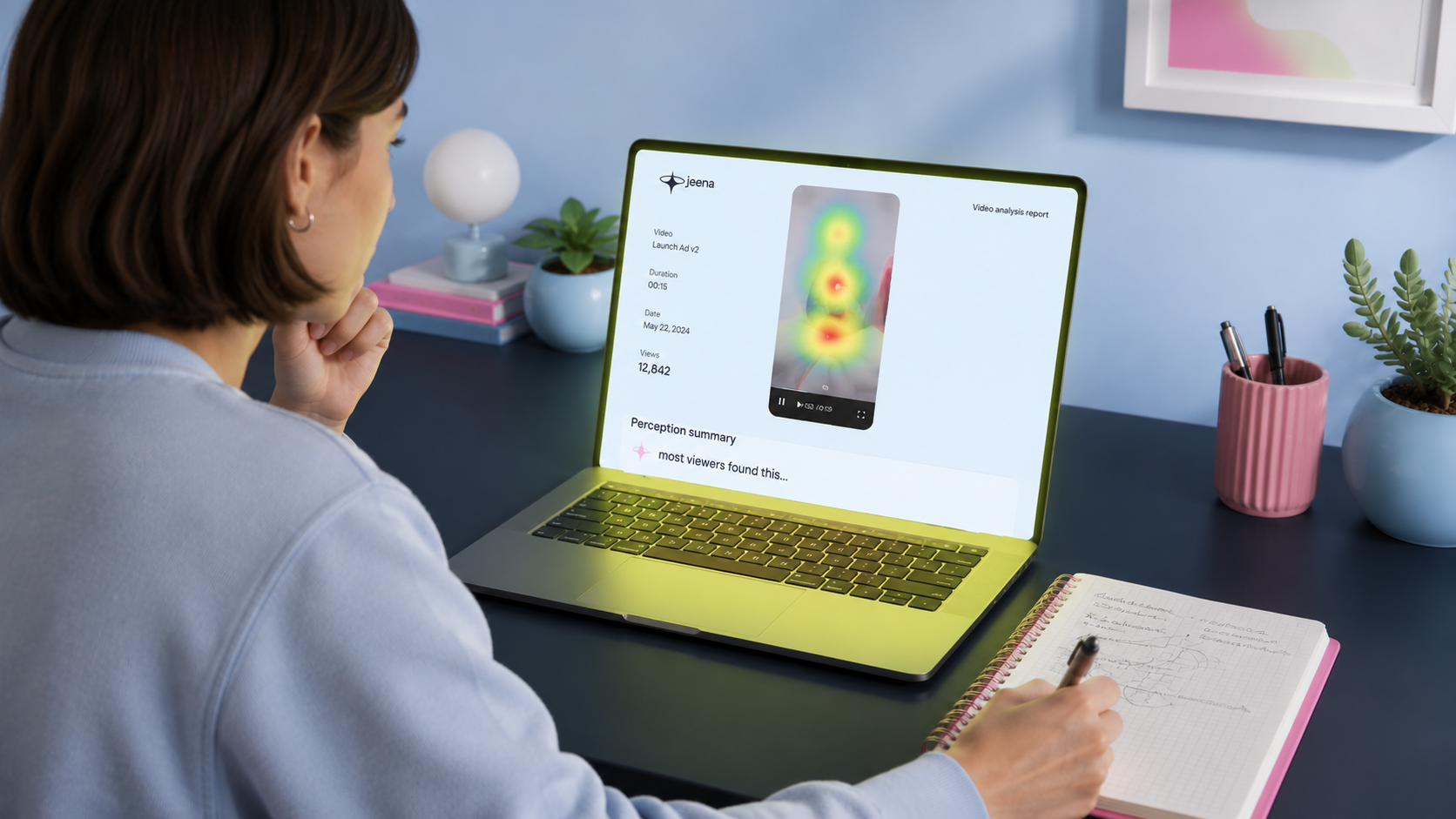
- Where the eye was at the dropFront-camera gaze tracking samples each viewer 15 times per second. The aggregated heatmap shows you which on-screen element held the eye in the moments before the drop. Speaker face, background prop, title text, logo: each one suggests a different fix.
- Whether viewers reactedThe same front camera captures the viewer face. Blink rate and eyebrow raises. The wow-moments chart aggregates those signals per second across the panel. A video that kept viewers watching but produced no wow spikes is a different kind of failure than one that lost them entirely.
- How they described itAfter each watch, viewers fill out a short impressions survey in their own words. The perception summary in the report distils 5-10 individual responses into a few descriptors. That is the language part of the qualitative read: the words your audience would reach for if you asked them, before they have rationalised the experience.
What this looks like at the drop moment
Imagine the same video Instagram showed dropping at second four. In the Jeena report: at second 3, the heatmap was tight on the speaker; at second 4, attention scattered to a logo in the corner; at second 5, the wow-moments chart was flat. The perception summary read "scripted, hard to follow, busy frame."
That is a fix list. The logo is the problem (move it or shrink it). The scripted feel needs a rewrite. The flat reaction means whatever was at second 4 had no emotional payload. The Instagram dashboard would have said "drop at second 4" and stopped. Three measurement layers tell you what to actually do at second 4.
What this means if you are choosing what to do next
If you have already posted and want to understand why a video underperformed, the Instagram dashboard tells you what happened. To get from that to a fix, you need to know which element the eye was on at the drop, whether anyone reacted, and how viewers described the video. That is the work the dashboard is not designed for.
If you have a video about to go live, the most useful thing you can do with it is not check the dashboard after. It is test it on real viewers before. Five viewers in two days is enough to surface the recurring failure modes (per Jakob Nielsen, 2000). Fix the failure mode, then post the version that already cleared the test.
The dashboard answers the verdict question well. The other three layers answer the fix question, which is the one most creators are stuck on once they have looked at the curve.
See what the dashboard does not show
Upload your video to Jeena. Real viewers watch it on their phones with the front camera on, then share their impressions in a short survey. Jeena gives you the attention heatmap and visibility map (where the eye was), the wow-moments chart (where viewers reacted), a summary of how viewers perceived the video, and three concrete recommendations.
No "schedule a call." No sales rep. Upload, get your report in a couple of days, see what the dashboard could not show you.
Frequently asked
Does Instagram analytics not already show the retention curve?+
Yes. Instagram shows watch completion, the second-by-second retention curve, likes, comments, shares, follows. For deciding whether a video worked, that is enough. The honest gap is everything around the drop moment: which on-screen element the eye was on, whether viewers reacted, how they described the video, and whether the problem is fixable before the next post goes live. None of those are in the dashboard.
How many viewers do I actually need to test a video pre-publish to learn something useful?+
Five is usually enough to surface recurring failure modes. The reason is that the failures stack: if three of five viewers all disengage at the same frame, the fourth and fifth and the next ninety-five would too. The diminishing returns kick in fast. Past ten viewers, you are confirming what you already know rather than discovering new things. The original web-usability version of this finding is Nielsen and Landauer, 2000.
What is the closest analogue from web product analytics?+
Session recordings, like Microsoft Clarity or FullStory. The dashboard tells you bounce rates and conversion rates. The session recording shows you what one real user actually did on the page: which element they hovered over, where they got stuck, which button they tried to click and could not find. Jeena is the same pattern for video. Not a better dashboard, a different layer of data underneath it.
What is Jeena?+
Jeena is a neuromarketing platform for short-form video. Real people watch your video on their phone with the front camera on. Jeena captures their gaze direction, blink rate, eyebrow raises, and their impressions of the video in a short survey afterward. You receive an AI-powered report with an attention heatmap, a visibility map, a wow-moments chart, a summary of how viewers perceived the video, and three specific recommendations for making the video work harder.
How does Jeena measure viewer attention?+
Jeena uses smartphone front-camera gaze tracking. Each engager calibrates once, then watches your video. The platform records where their gaze lands frame by frame, flags moments of surprise from facial expression, and combines that with a short impressions survey afterward. The result is a per-second timeline of what real viewers actually looked at and felt, plus a summary of how they perceived the video overall.
How much does it cost to test a video on Jeena?+
A typical test costs around ten euros. See the pricing page for current rates.